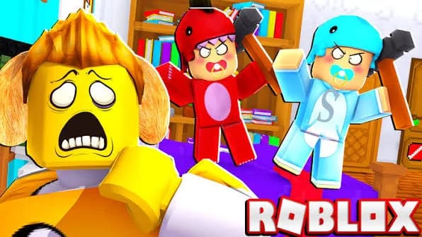
Roblox content lives or dies on the thumbnail. Whether you are uploading gameplay to YouTube or publishing an experience on the platform itself, that image decides whether anyone clicks. So how do you make a Roblox thumbnail that performs?
One clarification first, because the term covers two different jobs.
A YouTube thumbnail for Roblox gameplay runs at 1280 x 720 pixels, appears in search results and suggested videos, and competes against hundreds of similar uploads.
A Roblox experience thumbnail runs at 1920 x 1080 pixels on the platform, with a separate 512 x 512 icon, and follows Roblox moderation rules.
This article covers both, with most of the focus on YouTube since that is where the competition is fiercest.
Four elements separate a thumbnail that gets clicked from one that gets scrolled past.
Your avatar, clearly visible. Roblox viewers recognise characters instantly, and a face or figure anchors the image.
Text under four words, large enough to read on a phone screen at thumbnail size.
High contrast colours, because Roblox audiences respond to bright, saturated visuals far more than to subtle palettes.
A single focal point, since three competing elements produce an image nobody can parse in half a second.
The difficulty is knowing whether yours actually works before you upload.
At Pikzels available at pikzels.com, our Pikzels Score™ evaluates your thumbnail before publication, and One-Click Fix™ corrects what it flags.
6.3 million thumbnails produced, 7.9 billion views generated.
In this article we walk through the full process.
What Size Should a Roblox Thumbnail Be?
Say Goodbye to 10 of 10sTry Pikzels for Free.
Shortcut your way to millions of views.
The answer depends on where the image appears, and getting it wrong means cropping at the worst possible moment.
Table: Roblox thumbnail dimensions
Placement
Dimensions
Ratio
Format
YouTube thumbnail
1280 x 720
16:9
JPG or PNG
Roblox experience thumbnail
1920 x 1080
16:9
PNG or JPG
Roblox experience icon
512 x 512
1:1
PNG or JPG
Roblox group icon
512 x 512
1:1
PNG
As the table shows, 16:9 covers both main use cases, which means one design adapts across placements with minimal rework.
The YouTube thumbnail at 1280 x 720 carries a file size limit of 2 MB. Exceeding it means compression, and compression on a bright, high-contrast image produces visible artefacts exactly where your text sits.
Keep your export under that ceiling deliberately rather than discovering the limit at upload.
The Roblox experience thumbnail at 1920 x 1080 displays larger on the platform’s game pages, which allows slightly more detail than a YouTube thumbnail tolerates.
The 512 x 512 icon is the one creators underestimate. It appears small across the platform, in search and in recommendation rows, and a design that works at 1920 pixels frequently becomes unreadable when reduced to a square.
Design the icon separately rather than cropping your thumbnail.
Two practical rules apply across all sizes.
Keep critical elements away from the edges. Platforms crop unpredictably across devices, and text placed near a border disappears on some screens.
Check your design at 10% of its size. That is roughly how it appears in a mobile feed, and most thumbnails fail this test despite looking excellent at full resolution.
How to Make a Roblox Thumbnail Step by Step?
Six steps take you from idea to upload.
Step 1: Capture your avatar
Start with your character, since Roblox viewers recognise avatars instantly.
Use Roblox Studio or an in-game screenshot, then remove the background. A clean cutout matters more than a high-resolution one.
Step 2: Choose a high-contrast background
Bright, saturated colours outperform subtle palettes on this audience.
Gradients work well, as do blurred gameplay captures that suggest context without competing for attention.
Step 3: Add text under four words
This is where most thumbnails fail.
Long phrases become unreadable at thumbnail size. Keep it to three or four words maximum, in a heavy sans-serif font with a thick outline or drop shadow so it separates from the background.
Step 4: Establish one focal point
Your avatar or your text leads, not both.
Three competing elements produce an image nobody parses in the half second they spend deciding. Make one thing dominant and let the rest support it.
Step 5: Check it at small size
Reduce your design to roughly 10% and look again.
That is how it appears in a mobile feed. Most thumbnails that look excellent at full resolution fail completely here, and this single check catches the majority of problems.
Step 6: Score it before uploading
Everything above tells you how to build a thumbnail. None of it tells you whether yours will perform.
At Pikzels available at pikzels.com, the Pikzels Score™ evaluates legibility, contrast, visual hierarchy and curiosity before you publish, and One-Click Fix™ corrects what it flags.
You find out before uploading rather than after.
Common Roblox Thumbnail Mistakes to Avoid
Several errors appear repeatedly across the category. Here are the ones that cost the most clicks.
Writing too much text, beyond four words
Using thin or decorative fonts that vanish at small size
Filling the frame with three or more competing elements
Choosing low contrast between text and background
Placing elements near the edges, where cropping cuts them
Reusing the same design across every upload
Promising something the video does not deliver
Skipping the small-size check before uploading
Among these, excessive text causes the most damage and feels the most counterintuitive.
Creators add words believing more information produces more clicks. The opposite happens. A viewer spends roughly half a second deciding, which is not enough time to read a sentence.
Three or four words, large and bold, outperform a full phrase every time.
Thin fonts fail for the same reason. A typeface that looks elegant at full resolution disappears entirely when reduced to a mobile feed. Heavy sans-serif with a thick outline is not a stylistic preference here, it is a functional requirement.
Clickbait that misleads deserves separate attention, because the damage is delayed rather than immediate.
A misleading thumbnail generates the click and then loses the viewer within seconds. YouTube reads that retention drop and reduces your distribution, which means the tactic works once and penalises you afterwards.
Curiosity is fine. Deception is expensive.
Skipping the small-size check remains the error that most reliably separates thumbnails that work from thumbnails that do not. Reduce yours to 10% before uploading.
At Pikzels available at pikzels.com, the Pikzels Score™ flags these issues before you publish.
Frequently Asked Questions
What size should a Roblox thumbnail be?
It depends on placement. A YouTube thumbnail for Roblox gameplay runs at 1280 x 720 pixels in 16:9, with a 2 MB file size limit. A Roblox experience thumbnail runs at 1920 x 1080 pixels, and the accompanying experience icon is a square at 512 x 512. Design the icon separately rather than cropping your thumbnail, since a layout built for widescreen rarely survives the reduction to a square.
Can I make a Roblox thumbnail for free?
Yes. Free editors let you remove backgrounds, add text and export at the right dimensions, and Roblox Studio itself handles avatar capture at no cost. What free tools do not give you is any indication of whether the result will actually perform. You design, you upload, and you find out from your click-through rate days later.
How do I get my avatar into a thumbnail?
Two routes work. Roblox Studio lets you position your character, adjust lighting and capture a clean render. An in-game screenshot is faster but gives you less control over pose and angle. Either way, remove the background afterwards so your avatar sits cleanly against whatever you design behind it.
How much text should a Roblox thumbnail have?
Three or four words maximum. Viewers spend roughly half a second deciding whether to click, which is not enough time to read a sentence. Use a heavy sans-serif font with a thick outline or drop shadow so the text separates from the background at any size.
Why do bright colours work better on Roblox?
The audience skews young and consumes content on mobile, where feeds are dense and attention is brief. Saturated colours and strong contrast create separation in a crowded row of thumbnails. Subtle palettes that look sophisticated at full size simply disappear in that context.
Does the thumbnail affect Roblox experience visibility?
It affects your click-through rate, which influences how the platform surfaces your experience. A low click-through rate signals that your listing is not compelling, and distribution reflects that. The thumbnail and icon are therefore not cosmetic decisions.
Is clickbait worth it for Roblox content?
No, and the penalty is delayed rather than immediate. A misleading thumbnail generates the click, then loses the viewer within seconds. YouTube reads that retention drop and reduces your distribution, which means the tactic works once and costs you afterwards. Curiosity is fine; deception is expensive.
How do I know if my thumbnail will perform?
You cannot tell by looking at it, which is the core problem. Most creators upload and wait for click-through data, then iterate across weeks. At Pikzels, the Pikzels Score™ evaluates legibility, contrast, visual hierarchy and curiosity before publication, and One-Click Fix™ corrects what it flags. You find out before uploading rather than after. Free trial at pikzels.com.